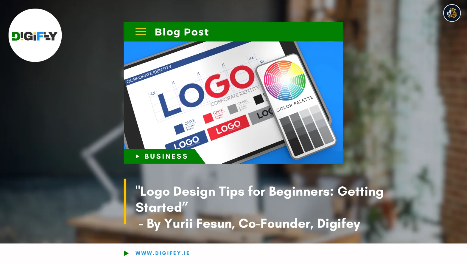
A logo is the face of your brand, the visual element that customers will remember and associate with your business. For beginners, designing a logo might seem like a daunting task, but with the right approach, it’s possible to create a memorable and effective design. Here are some essential tips to help you get started on your logo design journey.
1. Understand Your Brand
Before you start sketching ideas, take time to understand your brand’s identity. A logo should reflect your business’s mission, values, and target audience. Ask yourself:
- What does my brand stand for?
- Who is my target audience?
- What emotions or ideas do I want my logo to convey?
Example: A tech startup might focus on modernity and innovation, while a handmade crafts business might emphasise warmth and authenticity.
2. Keep It Simple
Simplicity is key to a successful logo. A clean and straightforward design is easier to recognise and remember. Avoid overcrowding your logo with too many elements or intricate details.
Tip: Think of iconic logos like Apple or Nike—simple designs with a powerful impact.
3. Choose the Right Colours
Colours play a crucial role in logo design, as they evoke emotions and convey meanings. Choose a colour palette that aligns with your brand’s identity.
- Red: Passion, energy, excitement
- Blue: Trust, reliability, professionalism
- Green: Growth, health, sustainability
- Yellow: Optimism, warmth, friendliness
Pro Tip: Use a maximum of 2-3 colours to keep the design cohesive.
4. Select Appropriate Fonts
Typography can say a lot about your brand. Whether you go for bold, modern fonts or elegant, serif styles, ensure the text is legible and aligns with your brand’s tone.
- Sans-serif fonts: Modern and clean
- Serif fonts: Classic and sophisticated
- Script fonts: Creative and personal
Tip: Avoid overly decorative fonts that might look unprofessional or be hard to read.
5. Make It Versatile
Your logo will appear across various platforms and materials—websites, business cards, packaging, and social media. Design a logo that works well in different sizes and formats.
- Ensure it looks good in both colour and black-and-white.
- Create a scalable design that remains clear even at small sizes.
Example: A logo with too much detail may not translate well when printed on small items like pens.
6. Sketch Before You Design
Start with a pencil and paper to brainstorm ideas before moving to digital tools. Sketching allows you to explore multiple concepts quickly and refine your ideas.
Tip: Create rough drafts of different shapes, symbols, and arrangements to see what works best.
7. Use Design Tools
Once you have a clear idea, bring your design to life using graphic design tools. For beginners, there are many user-friendly options:
- Canva: Simple drag-and-drop functionality for basic designs.
- Adobe Illustrator: A professional tool for advanced vector designs.
- FreeLogoDesign: A free tool to create logos quickly.
Pro Tip: Use vector-based tools to ensure your logo is scalable without losing quality.
8. Focus on Uniqueness
Your logo should stand out and be distinct from competitors. Avoid copying trends or designs that might make your logo blend in with the crowd.
Tip: Research your industry to identify common design elements and ensure your logo is original.
9. Test Your Logo
Before finalising your design, test it with friends, family, or colleagues. Gather feedback to see if it communicates your brand’s message effectively.
Questions to Ask:
- Is it memorable?
- Does it resonate with the target audience?
- Does it look good across different platforms?
10. Don’t Overcomplicate the Process
As a beginner, it’s easy to overthink your first logo design. Remember that logos can evolve over time as your brand grows. Focus on creating something simple and effective to start with, and refine it later if needed.
Conclusion
Logo design is a creative process that combines strategy, aesthetics, and brand identity. By understanding your brand, keeping the design simple, and focusing on versatility, you can create a logo that captures your business’s essence. With practice and attention to detail, even beginners can design a logo that stands the test of time and helps their brand shine.


