How to Create a Service Page That Sells: A Checklist for Crafting Effective Service Descriptions

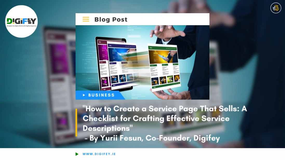
"How to Create a Service Page That Sells" - Image of hands holding web page layouts for an article on service page creation by Yurii Fesun on Digifey.

Let’s cut to the chase. If your service page isn’t turning visitors into clients, it’s a missed opportunity.

Every visit to your website should bring value. A well-designed service page can be your most vital sales tool, converting interest into action. But here’s the truth: a weak service page costs you leads.

With this guide, I’ll show you how to build a service page that stands out and sells—without fluff. Think of it as your checklist to turn potential clients into loyal customers.

Statistics show that 47% of users expect a webpage to load in two seconds or less. Nearly 38% will stop engaging if they find the content unattractive. This tells us that how your service page looks and feels matters more than ever.

Stick around to learn how to craft a service page that holds attention and drives action. You’ll come away knowing how to build something your visitors can’t resist clicking.


Introduction

The Importance of a Well-Structured Service Page

A well-crafted service page will make or break your conversions. It’s your handshake, pitch, and promise all in one. People need a reason to trust you, and how you present your services is key. An organized service page layout not only grabs attention but keeps visitors engaged. That engagement is crucial for leading to a conversion.

Did you know that over 70% of buying decisions start online? A straightforward service page is your direct connection to potential clients; cluttered or poorly designed pages will push them away.

A service page layout that’s thoughtfully organized makes the difference between someone clicking away or scrolling down to learn more. Effective service pages give users what they need without distractions.

You might want to check out HubSpot’s Guide to Crafting Service Pages for a detailed guide on improving your service page structure.

Setting the Tone

Know your audience. Speak their language. Keep it clear, direct, and get to the point. Your goal? Introduce your offering in a way that sticks. Whether it’s a specific product or service you’re presenting, the tone must match your client’s needs and expectations. Using relatable language keeps clients engaged and shows you understand their challenges. The first step is making sure your services resonate with the audience.


Clear Title

Crafting an Engaging Title

Titles are your first impression. They determine if someone stays or leaves. Your page title should hook the reader—informative, engaging, and strong enough to get people curious. The service page content starts with a title that tells visitors exactly what the page provides without misleading them. Think about what your website visitors are searching for and craft a title that delivers that.

Including Keywords

Keywords are crucial for SEO. But they aren’t just for search engines—they’re for your audience, too. If someone searches for “web design services,” that should be part of your title. Relevant keywords make your service more accessible to find and more transparent for the visitor. An engaging title featuring the right keywords improves search engine visibility and shows what the service you offer is all about.

For more guidance on keywords, see Moz’s Keyword Research Guide.


Service Description

Explaining Your Service

What exactly are you offering? What does your service do, and why should anyone care? People buy solutions to their problems, not just services. A comprehensive service page should clearly describe each service and explain how it solves a problem. Whether it’s website design, graphic design, or another service, spell out what the client can expect.

An excellent example of a service page is Arcurve’s Service Page. They provide visuals and detailed explanations to keep potential customers informed.

Highlighting Benefits

Benefits over features, always. How does your service make life better, easier, or more successful? People love benefits because they can picture them in their own lives. Provide real-life examples of how your service has solved problems. It’s about showing the value of your services and how they can change things for the better. Highlighting service page examples demonstrating these benefits helps potential clients grasp your offerings.


Who It’s For / Not For

Target Audience

You can’t serve everyone—and that’s okay. Specify who will benefit most from your service—and who won’t. This sets realistic expectations and draws in the right clients. Make it clear if your service suits a specific industry or client type. You can even include a list of “services” your ideal client might be interested in, helping them qualify themselves. This content is excellent for brand-focused service pages, allowing clients to see your expertise.


Expected Results

What Clients Can Expect

People want to know what they’re getting. Tell them exactly what results they can expect—make it tangible. If you offer website service page improvements, explain how they will boost traffic or enhance engagement. Set the right expectations by describing the service and expected outcomes.

Measurable Outcomes

Be specific. Vague promises don’t build trust. Numbers are robust—time saved, revenue increased, percentage growth. Use case studies to show past results. Quantify your value—such as how an improved landing page led to more leads or how a page layout change cut down bounce rates.


Prices and Timelines Listed

Transparency Builds Trust

People dislike ambiguity. They want to know the cost and the timeline. Being upfront about pricing builds trust. It may feel risky, but honesty helps. A service page layout with transparent pricing makes decision-making easier. No surprises build credibility.

Detailed Breakdown

Provide a breakdown of what’s included in the price. Show your value—what clients are getting for their money. Transparency is crucial, whether individual pages for each service or services on one page. Clarify what’s covered—consultations, materials, follow-ups. This makes it easy for clients to see the actual value. If you provide a separate page detailing costs, that helps even more.


Why Choose You?

Highlighting Your Unique Value

What sets you apart? This is your moment to tell clients why they should choose you over competitors. Are you faster? Do you offer personal attention? Higher quality? Highlight your unique value and inform potential clients why your company’s services stand out.

Proven Experience

Certifications and awards—these aren’t bragging; they’re credibility markers. People want to know they’re in experienced hands. Use real-life examples of how you’ve helped clients in the past. Include numbers, testimonials, and achievements to build trust.


Successful Case Studies

Real-World Success Stories

Nobody wants to be your first client. Use case studies to show others have trusted you and it worked out well. Walk potential clients through a problem, solution, and the result. Provide an example of a services page or client journey to highlight the success you bring. Showcasing services engagingly helps your audience see themselves in those success stories.

Check out Enterprise Ireland’s Success Stories for examples of successful service delivery.


Client Testimonials

Building Trust Through Testimonials

Let your clients do the talking. Testimonials are proof from someone else, and that’s powerful. Including testimonials on your company service page makes it easy for website visitors to see what others think.

Highlighting Specific Benefits

Highlight testimonials that focus on specific benefits. Statements like “It saved me hours every week” or “My sales doubled in three months” are gold. Ensure the service page content includes testimonials indicating the service consists of features that solve crucial problems.


Promotional Image

Make a Visual Impact

A strong visual can make a huge difference. Use high-quality promotional images to support your message. Include web design example visuals that reflect your service page web design examples and relate to your audience’s needs. Images should connect with the services and technologies you offer.


Service Process Overview

Step-by-Step Guide

People want to know what’s coming. Lay out your process clearly. If you have service page design examples, use them to illustrate. Clarity builds trust and shows clients how you will deliver results.

Timeline for Each Stage

Clients want timelines. Setting expectations is crucial—how long will each step take? Adding timelines on a page on your website reassures clients and builds confidence.


FAQs

Answering Common Questions

Potential clients always have questions. Answering them on a page that provides information removes uncertainty. This approach keeps clients on your page longer.

Providing Extra Detail

FAQs also give you the chance to add extra info. Think about what comes up most frequently and address it here. FAQs should show off your expertise while providing clarity.


Order Form

Encouraging Action

You’ve brought them here—now guide them to take action. Keep your form simple. Don’t ask for unnecessary details. A smooth service page order form will lead clients to action.

Security and Privacy

People care about their data. Reassure them. Clearly communicate your security measures to help clients feel comfortable. The service page layout should make privacy assurances clear.


Contact Information

Easy Communication

Make getting in touch easy. Whether it’s a phone call, email, or chat—clients need options. A business’s services page should include multiple ways to contact you.

Multiple Contact Methods

Provide different contact methods. Some prefer calls, others email. Offer both. Make sure the page requires clients to find this information efficiently.


Conclusion

Bringing It All Together

Your service page is the make-or-break point for potential clients. Ensure every section builds trust, shows value, and drives the action. Keep your service page simple, transparent, and audience-focused.

Final Call to Action

Encourage them to take action. Whether it’s contacting you or ordering, make it easy and clear. A service page on your website should always show visitors their next step.

For personalised support with your website or service page, contact our team at Digifey.ie. We’re here to help Irish businesses make the most of their digital presence.


Bullet Point Summary: Key Takeaways

  • Craft a clear and engaging title to draw readers in.
  • Focus on benefits rather than just features in your service description.
  • Be transparent about pricing and timelines—it builds trust.
  • Showcase real-world success through case studies and testimonials.
  • Lay out the service process clearly so clients know what to expect.
  • Use an easy-to-complete order form and multiple ways to contact you.

Your service page is your pitch—make it clear, persuasive, and actionable.

Facebook
LinkedIn
WhatsApp
Twitter
Email